

The world of cryptocurrency trading is often characterized by volatility and uncertainty. For investors looking to understand Bitcoin’s (BTC) price movements, various analytical tools have emerged. One such tool, the BTC rainbow chart, has gained popularity among traders and enthusiasts alike. But what exactly is the BTC rainbow chart, and how can it help predict the future price of Bitcoin? In this article, we will explore the mechanics of the BTC rainbow chart, its significance, and how to utilize it effectively in your trading strategy.
Understanding the BTC Rainbow Chart
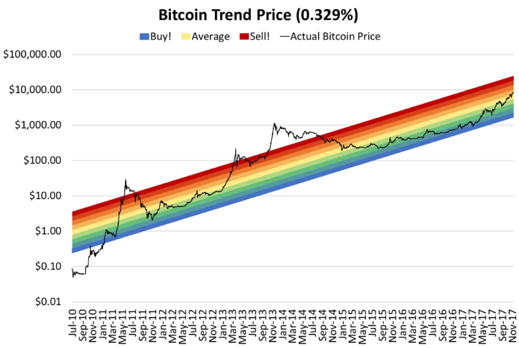
The BTC rainbow chart is a visual representation that maps Bitcoin’s price over time using a series of colored bands. Each color represents a different price range, indicating whether Bitcoin is in a phase of growth or decline. The chart essentially uses a logarithmic scale, which allows for better visualization of price movements over long periods.
How the BTC Rainbow Chart Works
- Logarithmic Scaling: Unlike linear charts, the BTC rainbow chart employs a logarithmic scale, making it easier to see percentage changes rather than absolute price changes. This is particularly useful in the crypto market, where price movements can be extreme.
- Color-Coded Bands: The chart features a spectrum of colors, each representing a specific price range:
- Red: Overbought conditions, suggesting a price correction may be imminent.
- Orange: Market uncertainty, indicating potential for pullback.
- Yellow to Green: A bullish market phase, suggesting growth potential.
- Blue: Historically low price range, indicating buying opportunities.
- Historical Data: The BTC rainbow chart is based on Bitcoin’s historical price data, allowing traders to gauge where the current price stands concerning its past peaks and troughs.
The Significance of the BTC Rainbow Chart
Using the BTC rainbow chart holds several advantages for traders and investors:
1. Visual Representation of Trends
The colorful design of the rainbow chart provides a quick visual understanding of Bitcoin’s market cycles. By simply glancing at the chart, investors can identify whether Bitcoin is in a bull or bear market phase.
2. Long-Term Perspective
The BTC rainbow chart emphasizes long-term price trends rather than short-term fluctuations. This perspective is valuable for investors looking to hold Bitcoin over extended periods, as it discourages knee-jerk reactions to daily price movements.
3. Strategic Entry and Exit Points
By identifying the color bands on the chart, traders can make more informed decisions regarding entry and exit points for their investments. For instance, entering during a green or blue band may indicate a favorable buying opportunity.
How to Use the BTC Rainbow Chart Effectively
To leverage the BTC rainbow chart in your trading strategy, consider the following steps:
1. Analyze the Current Position
Check the current position of Bitcoin on the rainbow chart. If it’s in the red or orange zones, it may indicate that Bitcoin is significantly overvalued, prompting a potential correction.
2. Combine with Other Indicators
While the BTC rainbow chart is a powerful tool, it should not be used in isolation. Combine it with other technical indicators, such as moving averages or RSI (Relative Strength Index), to confirm signals.
3. Use for Long-Term Planning
The BTC rainbow chart is best utilized for long-term investment strategies. If you’re a trader focused on short-term gains, keep in mind that the chart emphasizes larger price movements over time.
4. Stay Informed About Market News
External factors, such as regulatory changes, market sentiment, and macroeconomic trends, can influence Bitcoin’s price. Keeping abreast of these developments will provide context for the signals you see on the rainbow chart.
Limitations of the BTC Rainbow Chart
Despite its benefits, the BTC rainbow chart has some limitations that investors should be aware of:
1. Not a Guarantee
While the chart provides historical context, it does not guarantee future performance. External factors can lead to outcomes that deviate significantly from historical patterns.
2. Interpretation Can Vary
Different traders may interpret the color bands differently. Some might see a buying opportunity in a red zone, while others may choose to wait for a more favorable condition.
3. Subject to Market Sentiment
The BTC rainbow chart cannot account for sudden shifts in market sentiment or unforeseen events that can cause dramatic price movements.
Conclusion
The BTC rainbow chart serves as a colorful and insightful tool for understanding Bitcoin’s price trends over time. By visualizing price movements within color-coded bands, traders and investors can gain a clearer perspective on where Bitcoin may be heading in the future.
While it provides an engaging and detailed look at Bitcoin’s historical price action, it’s essential to remember that the chart should be used in conjunction with other trading tools and market analysis for the best results. By combining the BTC rainbow chart with fundamental analysis and market news, investors can make informed decisions that align with their trading strategies.
In an increasingly volatile crypto market, tools like the Bitcoin rainbow chart can help demystify Bitcoin’s price dynamics and guide your investment choices as you navigate the exciting world of cryptocurrencies.